THE CITY OF OPA-LOCKA
BRAND IDENTITY DESIGN CASE STUDY (SPEC)
Taking a century old Miami suburb featuring a stunning display of Moorish Revival architecture and giving it a brand identity worthy of the character it exudes.
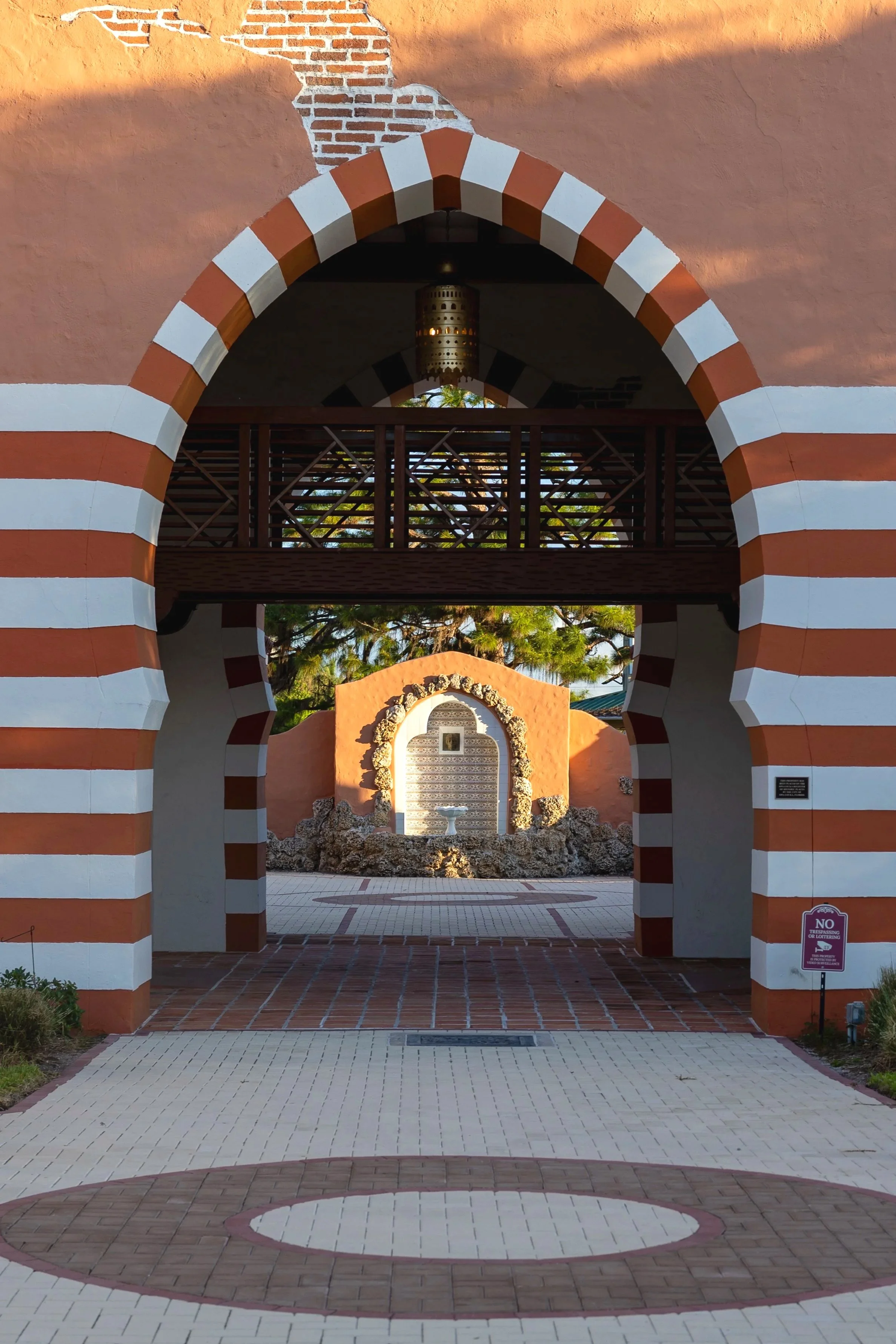
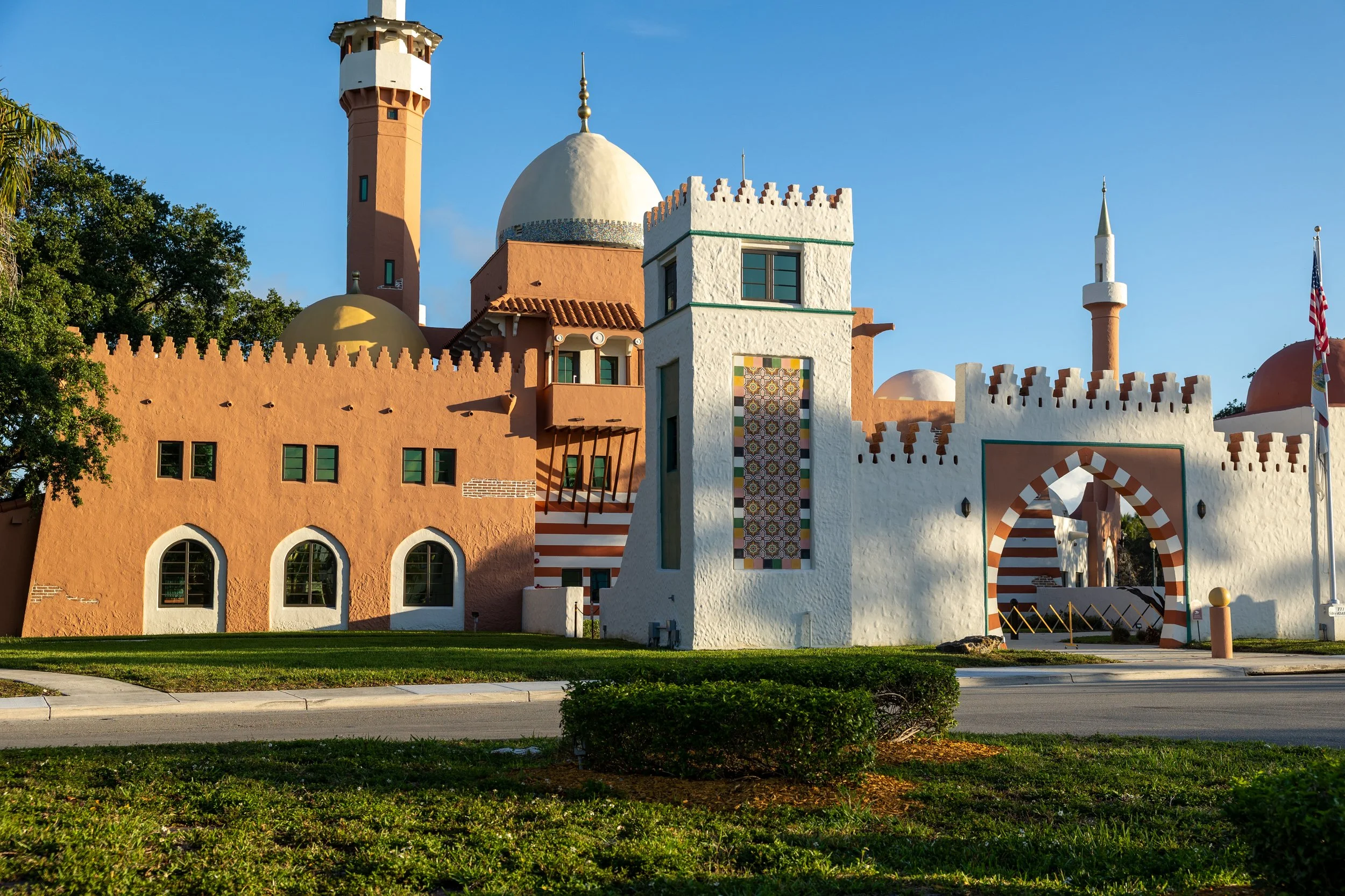
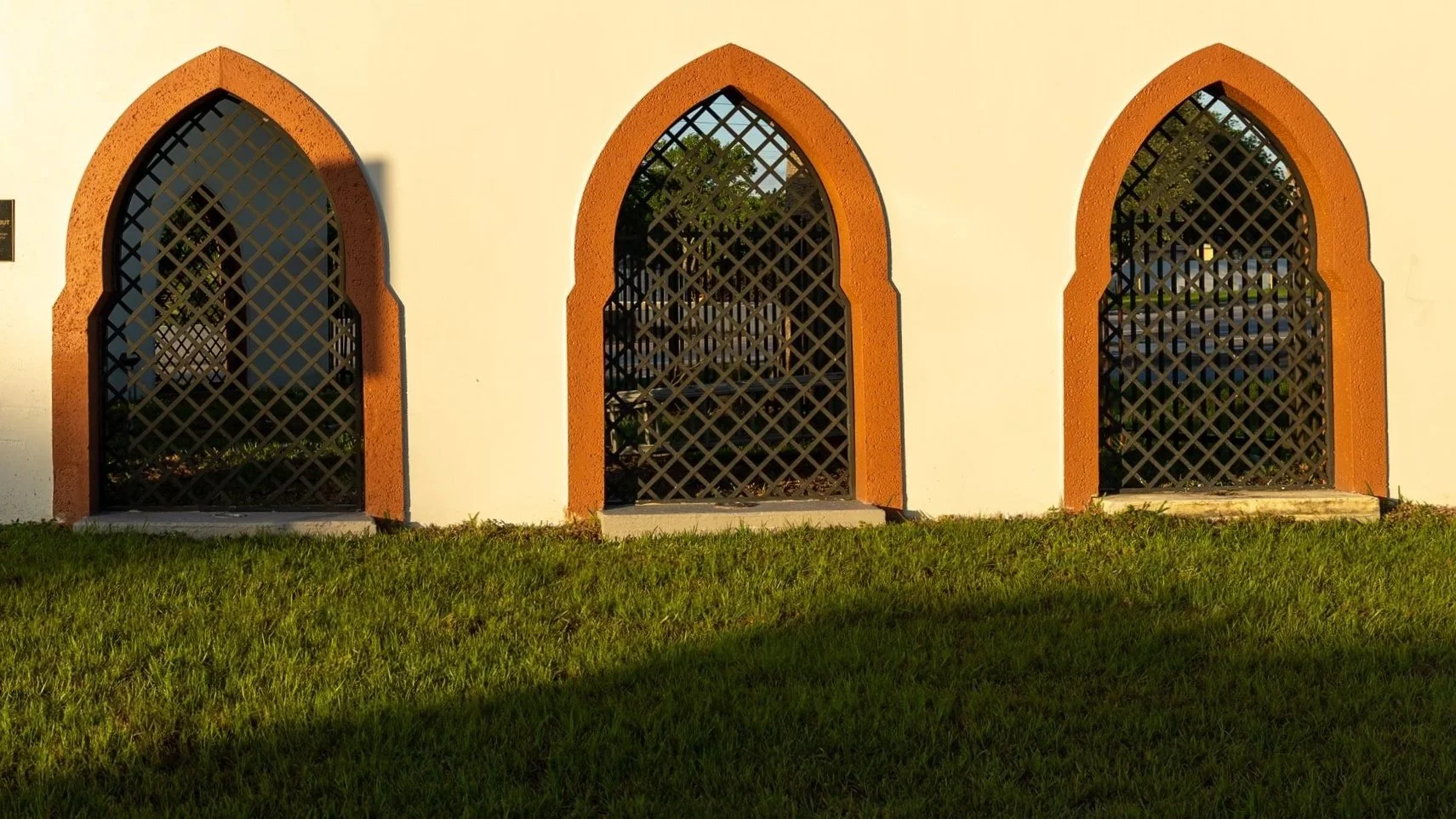
Famed aviator Glenn Curtiss led the charge to found Opa-locka back in 1926. From the start, its iconic architecture in the Moorish Revival style was implemented in the fabric of the city. Local businesses, homes, road names (e.g., Sesame Street, Ali Baba Avenue) all had a decidedly Neo-Moorish flair.
The crown jewel was Opa-locka’s administration building, now proudly standing as the Historic City Hall. Dramatic archways, intricate tile work, soaring domes tipped with minarets, and geometric adornments on roofs made Opa-locka a city like none other in the United States, let alone South Florida. To this day, Opa-locka has one of the largest collections of Moorish Revival architecture in the Western Hemisphere.
about opa-locka
brand assessment
The design process begins in the Mapping Phase by getting a lay of the land. It’s vital to understand how the brand currently exists with its present brand identity systems through conversations with residents, business owners, elected officials, and visitors.
This is a spec project that didn’t actually involve the stakeholders of the city, so subjective perceptions and experiences were used to craft this brand assessment.
This thorough feedback and assessment were used to begin shaping a brand identity that reflects the aspirations of the city.
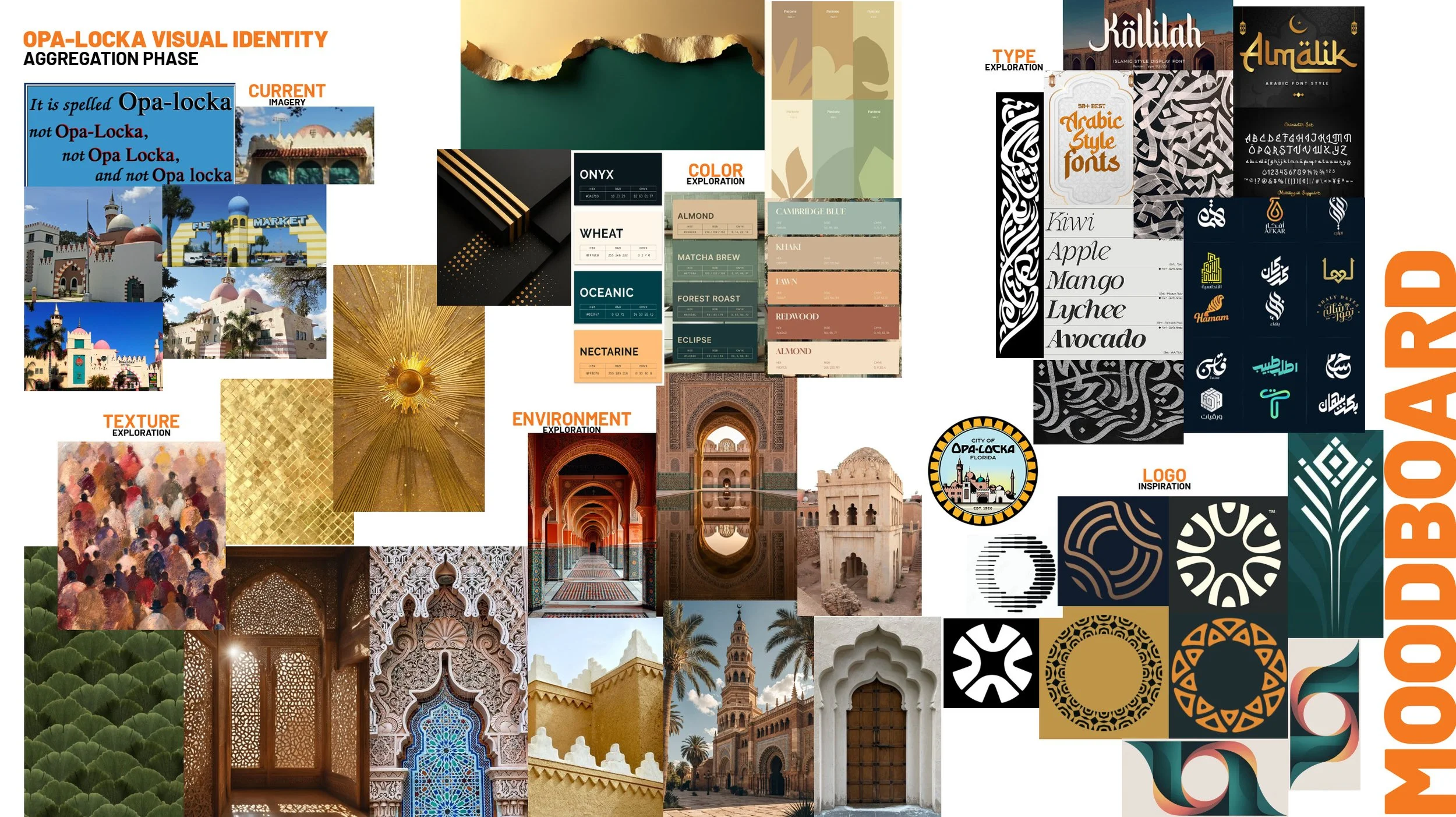
Moving to the Aggregation Phase, a moodboard is introduced as a great way to connect the theoretical and aspirational concepts of the city’s brand with visual inspiration to find a common ground between the two.
DESIGN CRITIQUES
Opa-locka has long had a seal as an outward representation of the city. This seal was recently re-imagined (by the City, shown on the right), showcasing the newly restored Historic City Hall building on full display within a circular design with 28 golden “petals” symbolic of the 28 residents that voted to incorporate the city.
While the illustration within the seal is well crafted, it is also quite intricate. Intricate designs usually lose their details and become muddled in smaller applications (i.e. embroidery, letterheads, stationery). A seal is often reserved for official municipal documents (town charters, City Council meeting minutes, etc.), but for other applications like city departments, billboards, and the city website, a separate logo is used to promote the city.
DESIGN REQUISITES
A mark that:
is separate from the city seal
works at small and large scale
captures unique city elements/symbols
is memorable and easy to identify
features a reworked logotype
is complete with a brand identity system buildout
SKETCHES AND EARLY DESIGN IDEAS
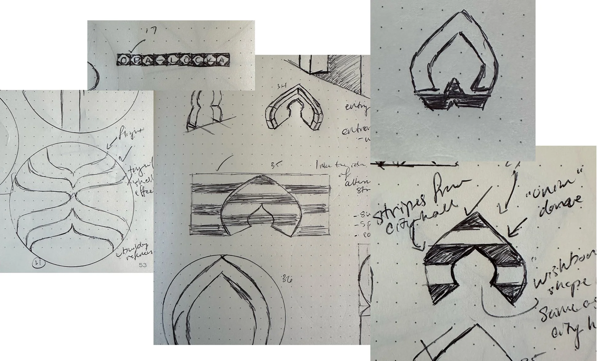
The sketching process allows loose ideas to become realistic visuals. Here in the Design Phase, vector images are explored based on the initial sketches to provide the client more tangible visual concepts.
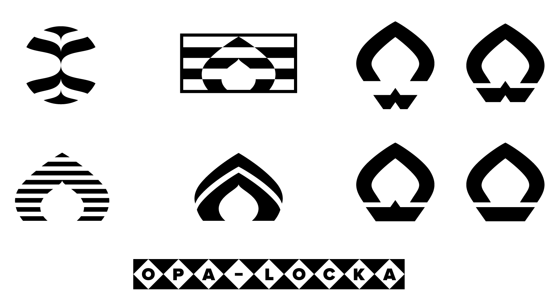
FINAL SELECTION & LOGOTYPE LOCKUPS
After further refinement, this striking design was selected to accomplish the design requisites that were prioritized at the onset of the project.
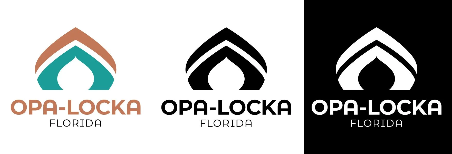
The logo mark captures three different architectural elements in one mark, highlighting the iconic structures of the city.
The mark’s strong foundation and upward pointing orientation symbolize progress, strength, and new beginnings.
The logotype features an alternate version of the “A” character with a rounded top, further pulling on the design of archways seen in the city.
The terra cotta and muted teal colors are seen in the buildings throughout Opa-locka. They also balance a grounded, yet aspirational aesthetic.
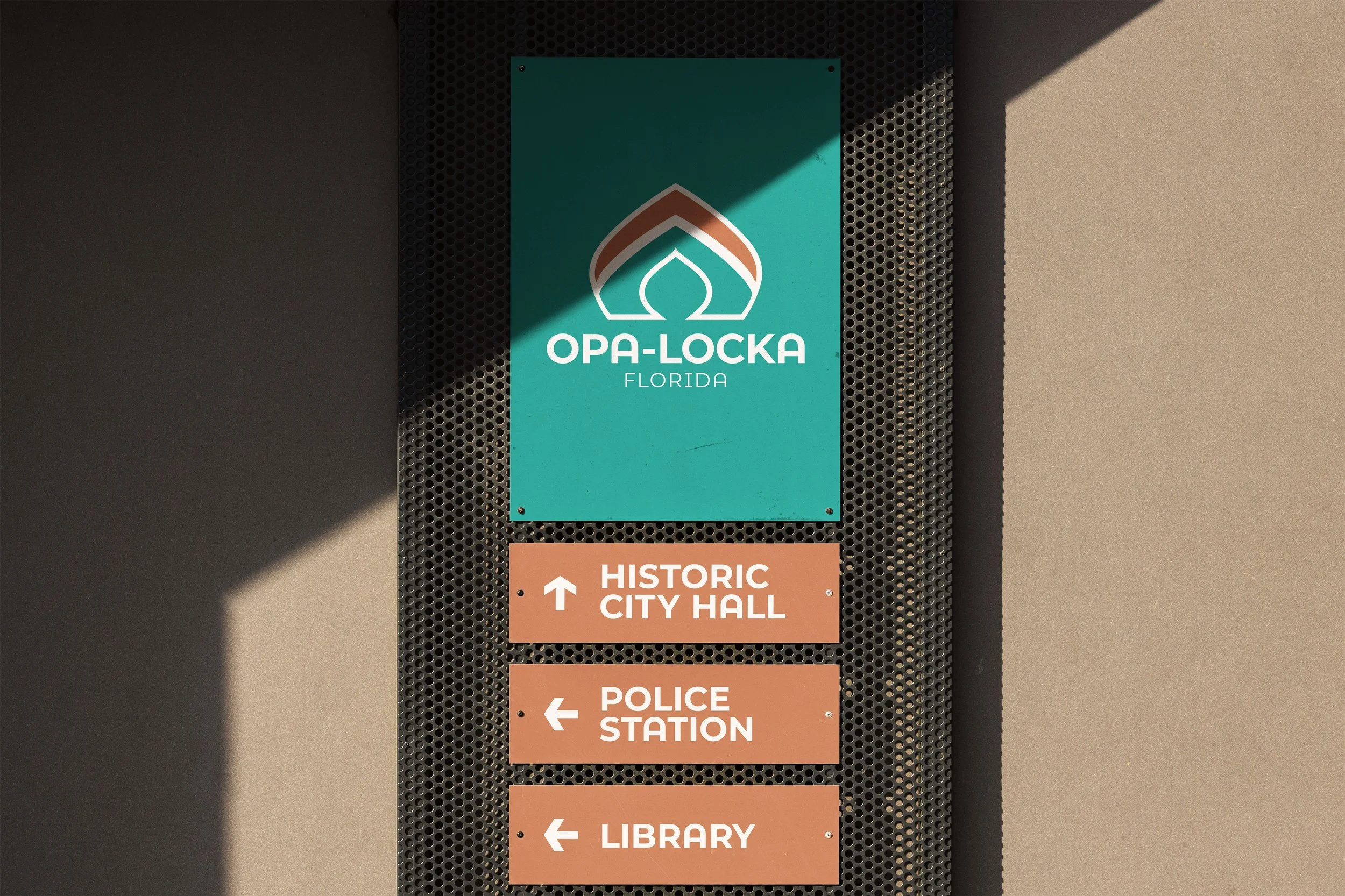
There’s a big difference in simply viewing a brand identity on a white background versus seeing it in action. Mockups allow clients to view how their new logos will appear across multiple applications.
REAL-WORLD MOCKUPS
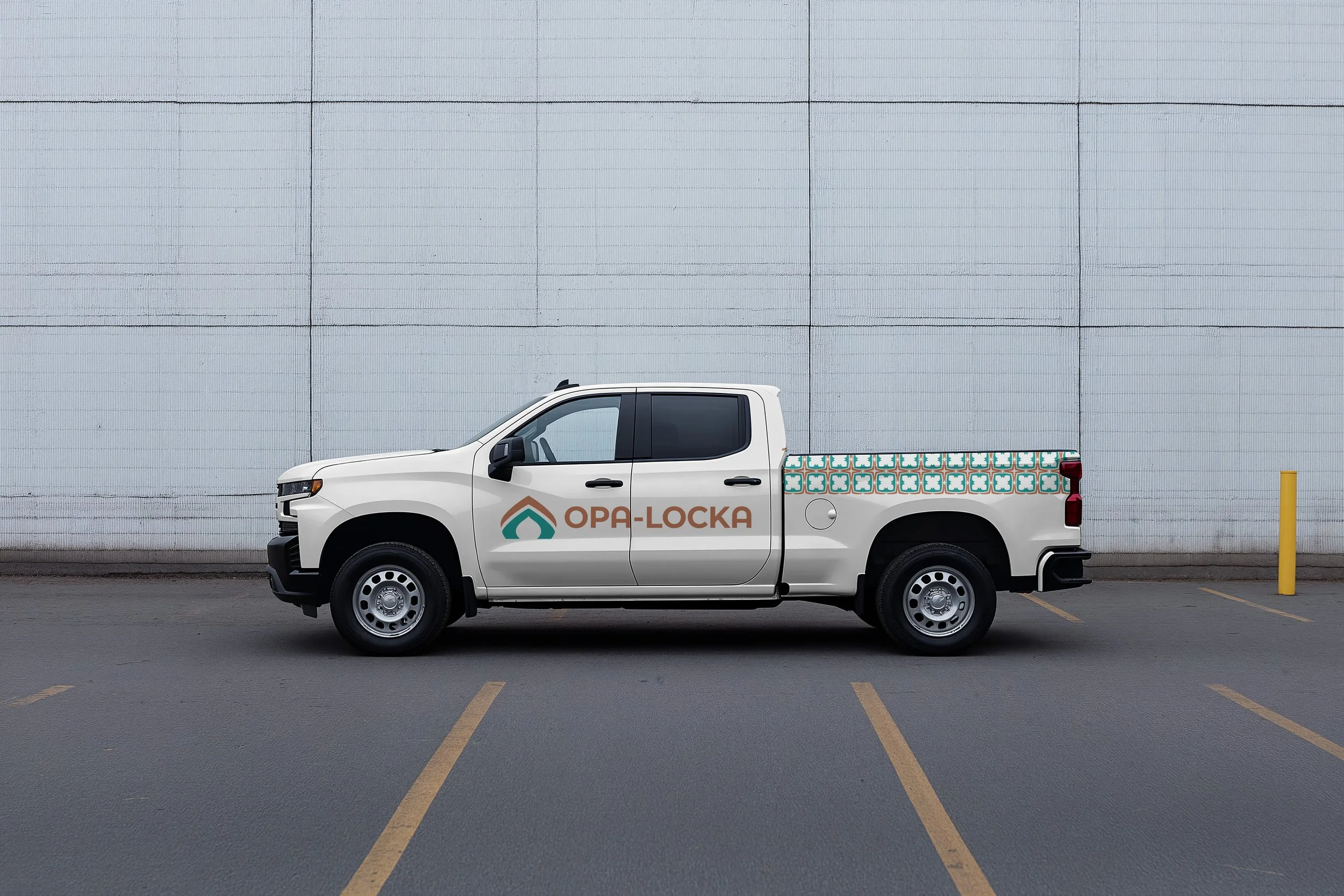
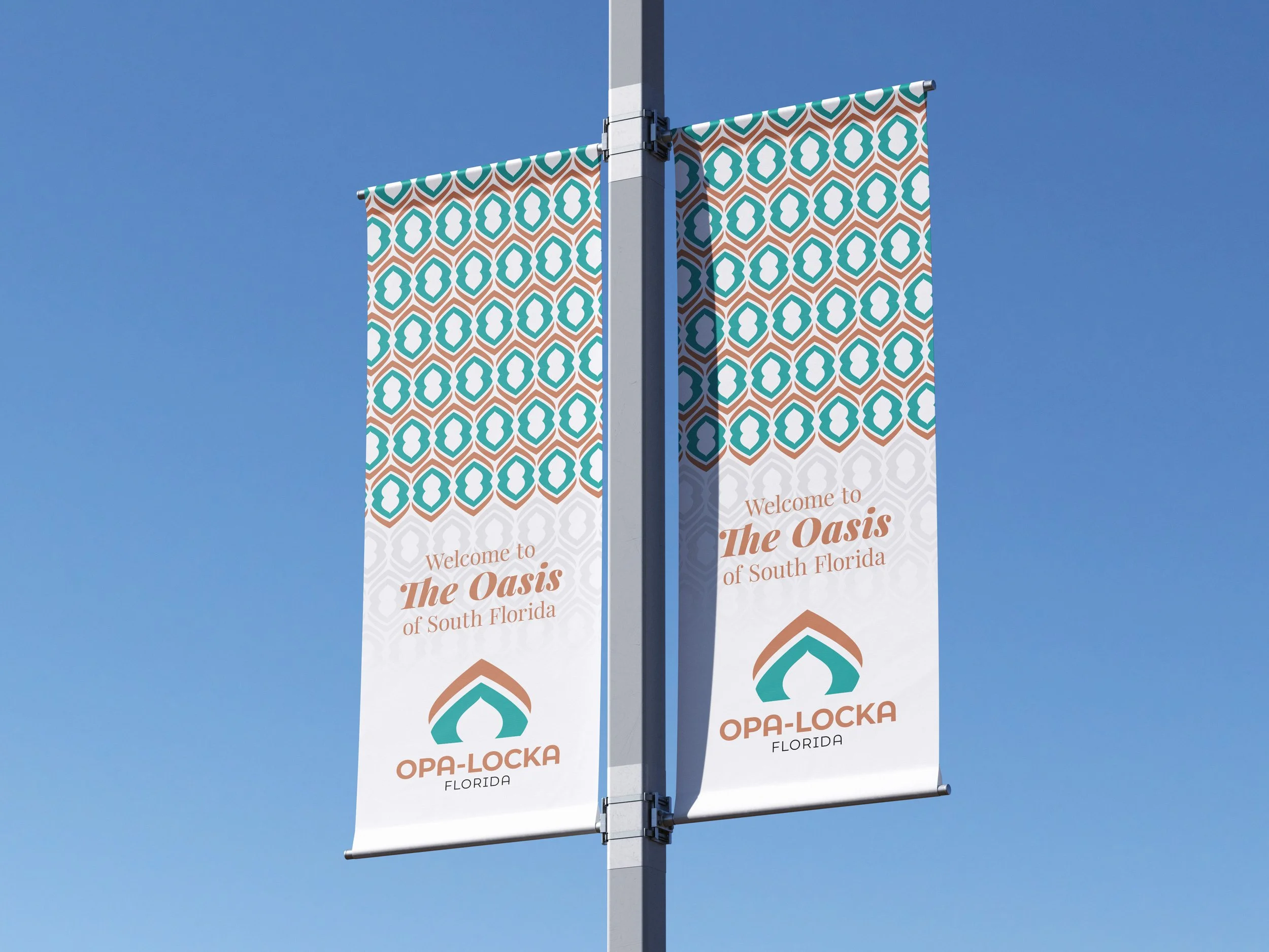
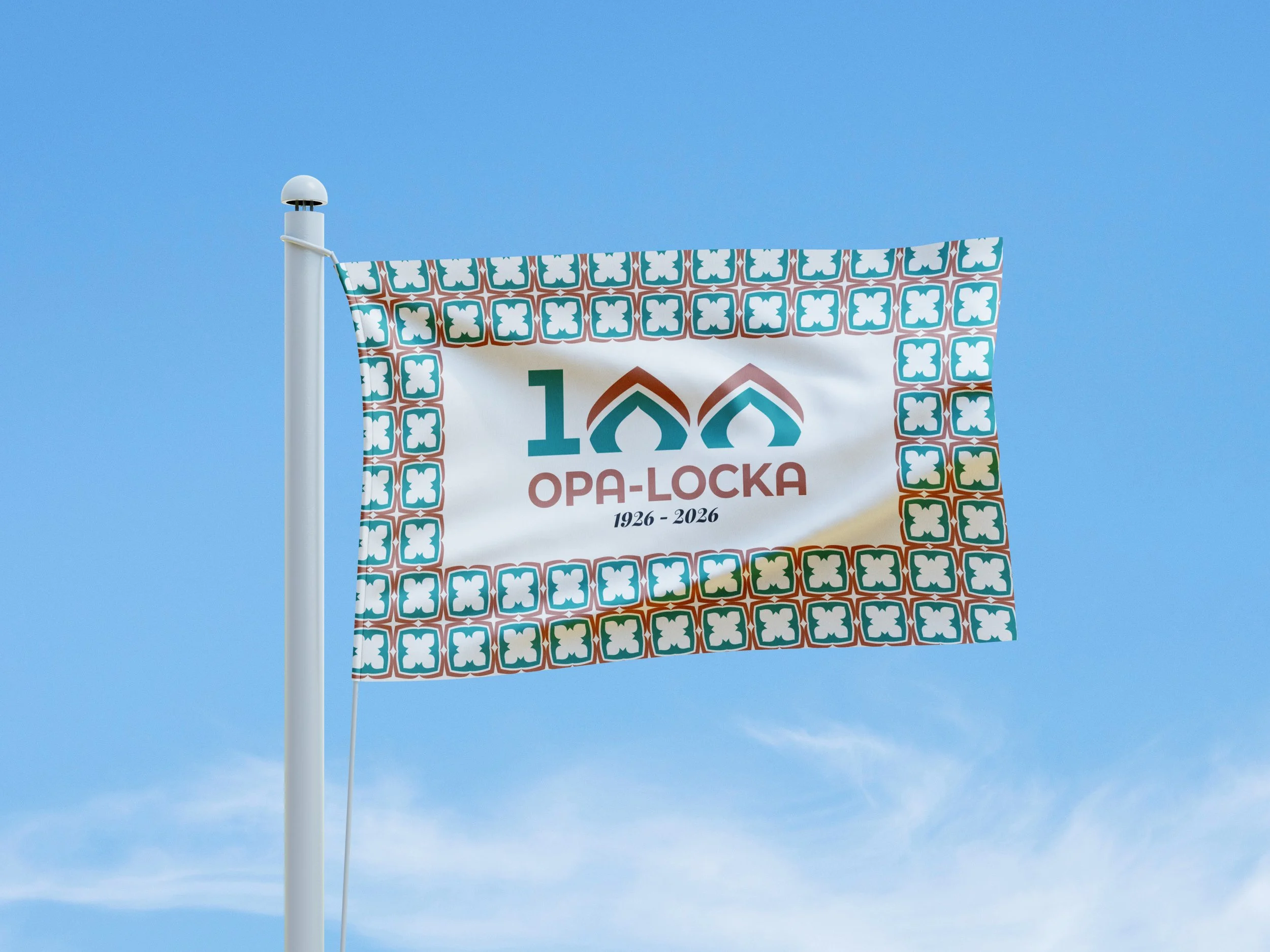

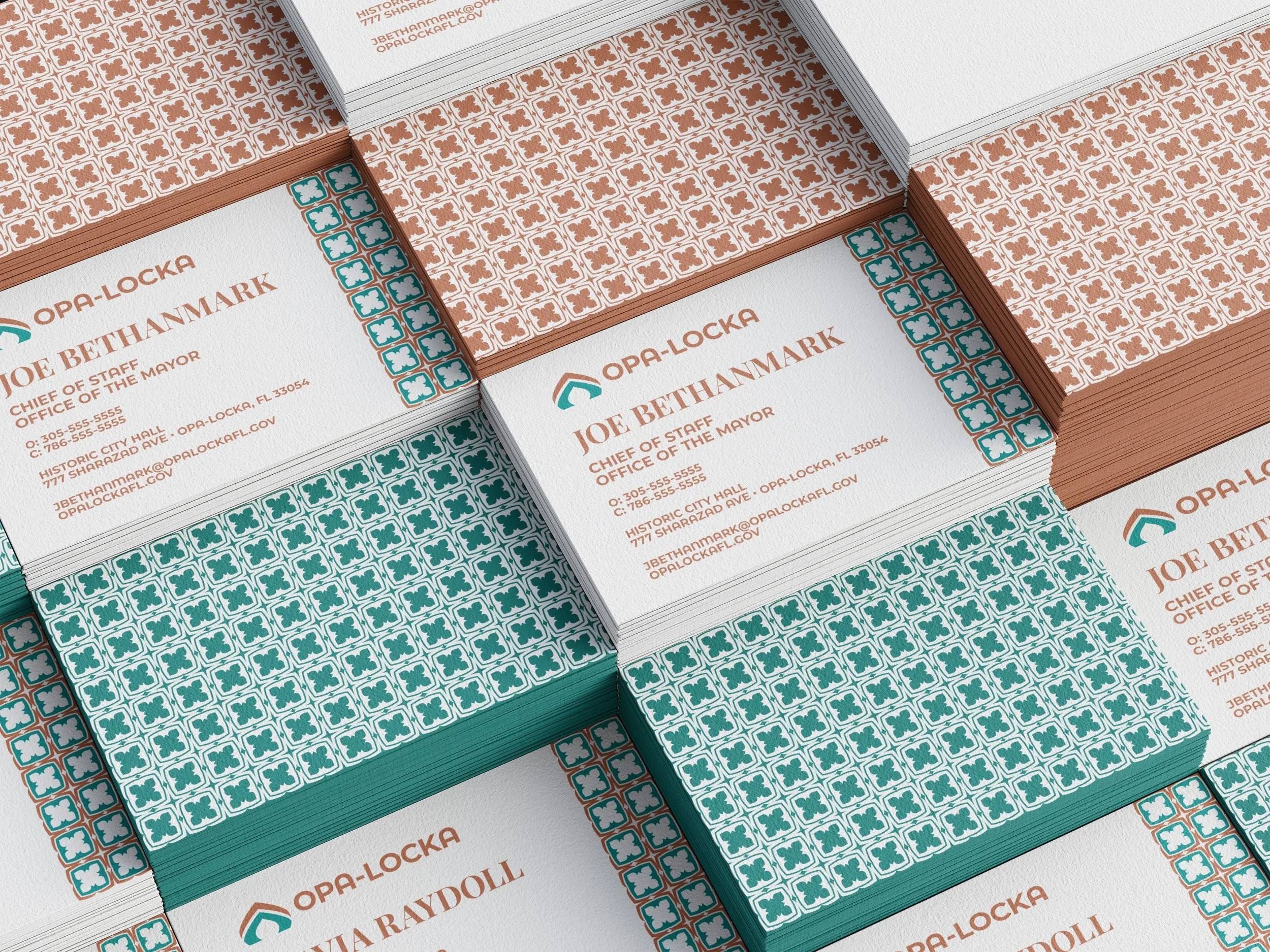
A strong revised brand identity allows the City of Opa-locka to separate its marketing functions from its civic duties handled by the city seal.
Taking cues from the city’s distinct architecture, MandelaMade was able to craft a mark that pays homage to the Moorish Revival style while still remaining simple and recognizable across various uses.
THE CITY OF OPA-LOCKA
BRAND IDENTITY DESIGN CASE STUDY (SPEC)