THE TOWN OF GOLDEN BEACH
BRAND IDENTITY REDESIGN CASE STUDY (SPEC)
One of the nation’s most exclusive locales, MandelaMade redesigned the brand identity of Golden Beach to mirror the understated charm of the town: unmistakably bold and contemporary, yet still restrained and timelessly elegant.
PHOTO COURTESY: TOWN OF GOLDEN BEACH
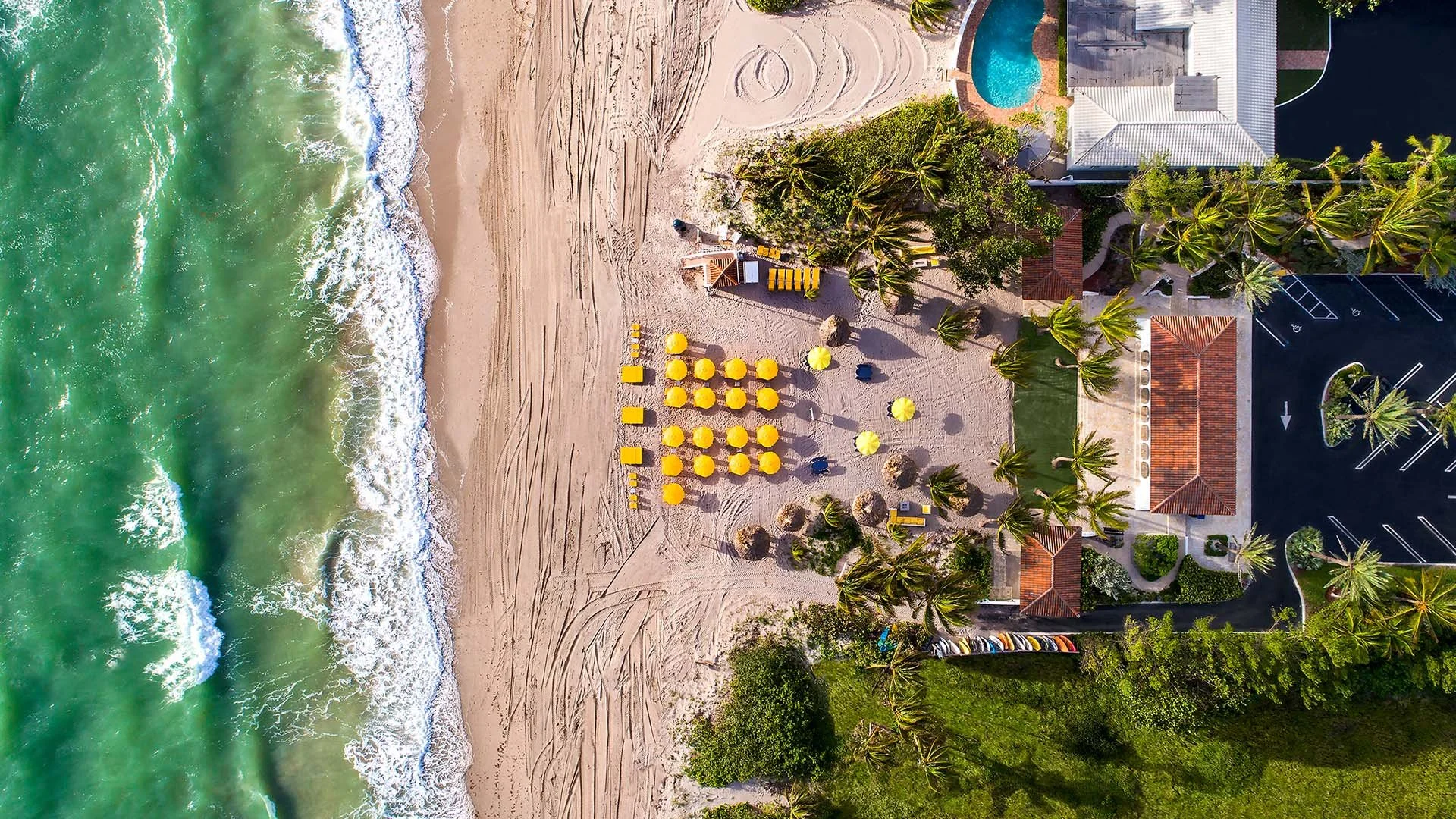
PHOTO COURTESY: TOWN OF GOLDEN BEACH
about GOLDEN BEACH
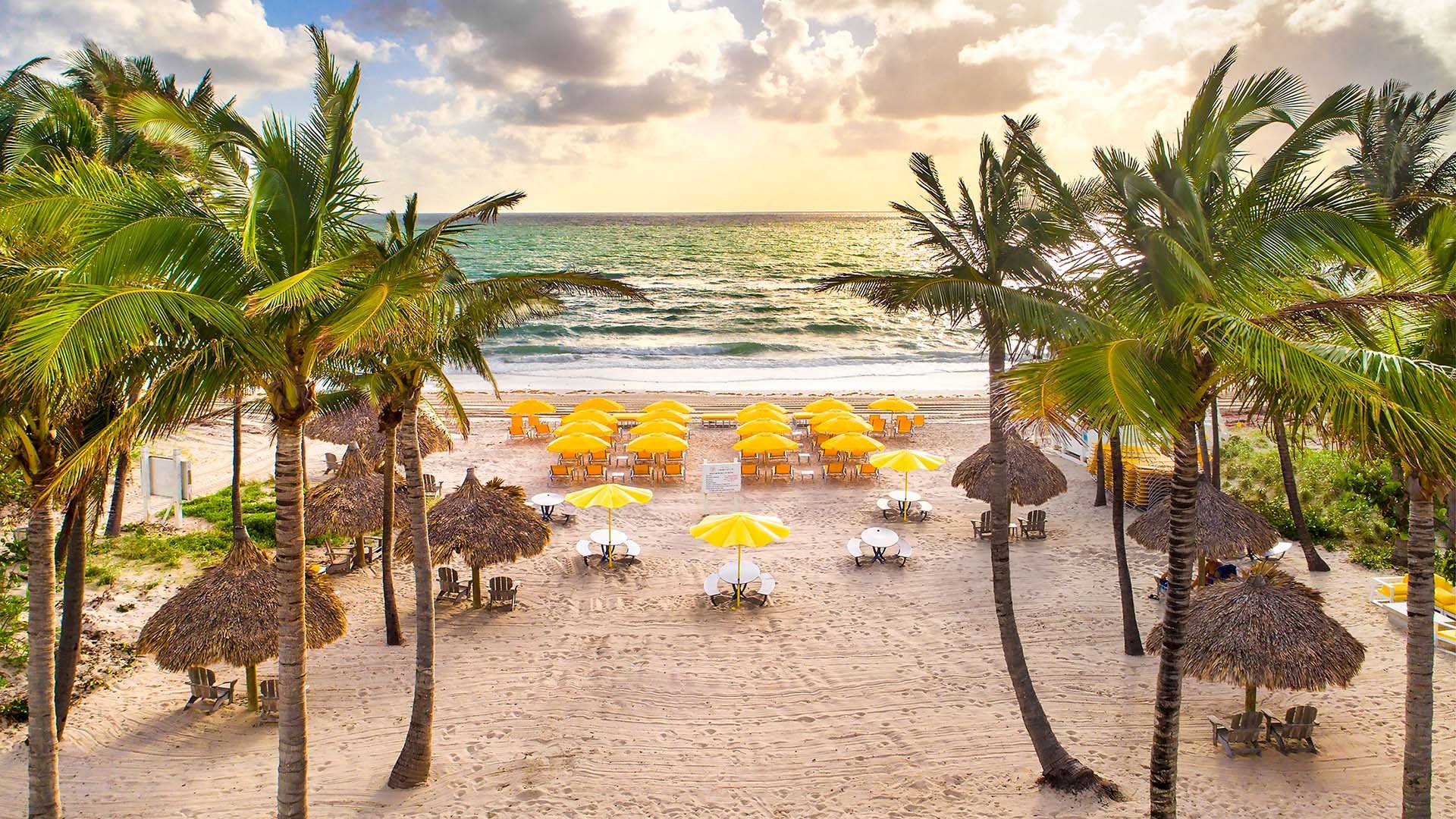
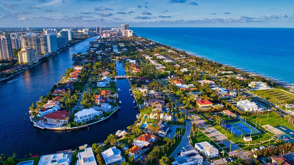
Tucked in the extreme northeast corner of Miami-Dade County, the affluent town of Golden Beach features one of the wealthiest ZIP codes in the nation. A coastal enclave, Golden Beach lies in between the Intracoastal Waterway and the Atlantic Ocean. Florida State Road A1A is the major thoroughfare through the town with stately properties flanking the palm tree lined roadway.
Golden Beach has been incorporated since 1929 and is known for its grandiose homes, limited access, and stringent zoning arrangements. The town is almost entirely comprised of single-family homes; the only exceptions are the Town Hall and public service buildings. Golden Beach is a quiet place of residence for the (very) well-to-do and this project’s aim was to reimagine the brand identity while keeping the elegance that the town is known for.
brand assessment
The design process begins in the Mapping Phase by getting a lay of the land. It’s vital to understand how the brand currently exists with its present brand identity systems through conversations with residents, business owners, elected officials, and visitors.
This is a spec project that didn’t actually involve the stakeholders of the city, so subjective perceptions and experiences were used to craft this brand assessment.
This thorough feedback and assessment were used to begin shaping a brand identity that reflects the aspirations of the city.
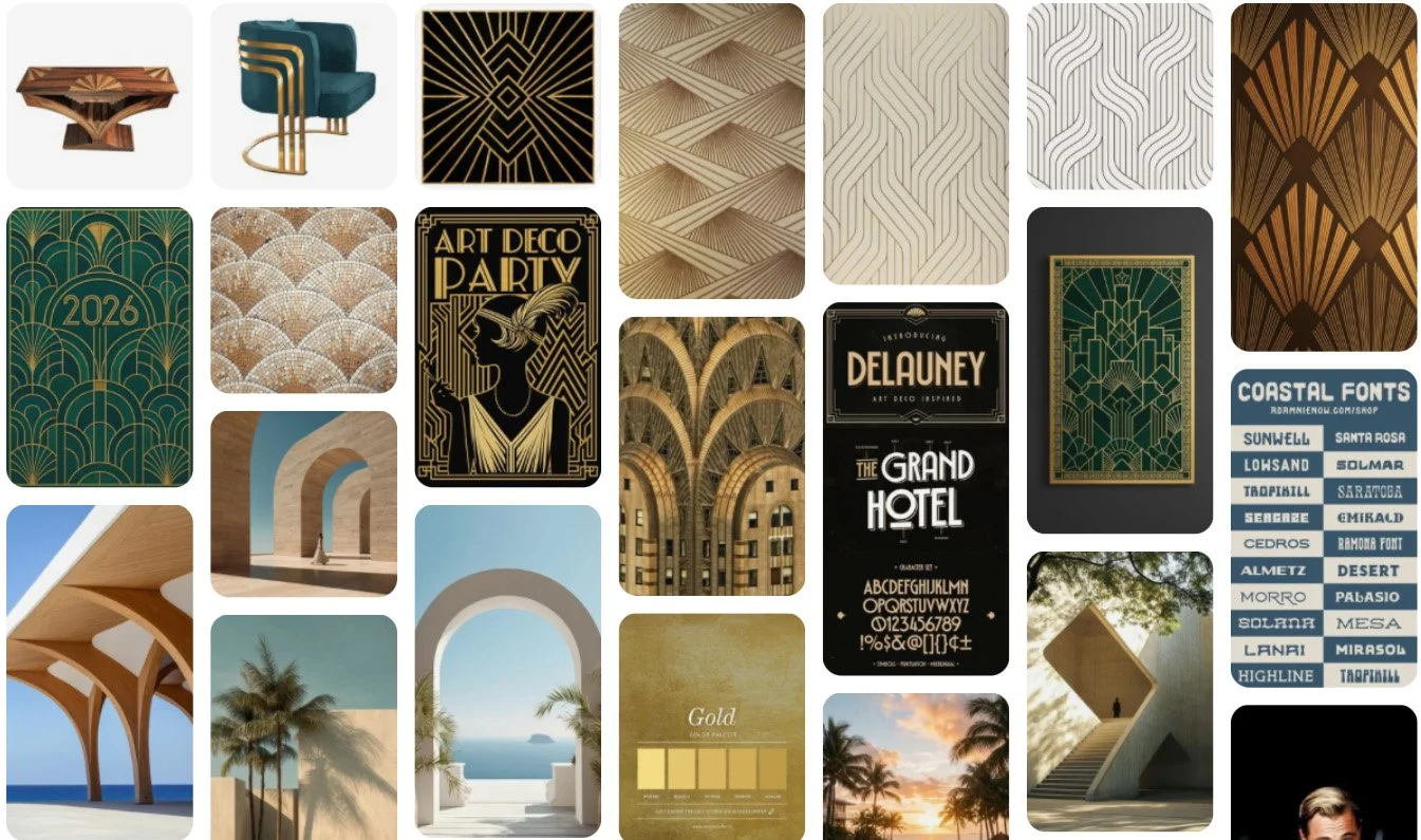
Moving to the Aggregation Phase, a moodboard is introduced as a great way to connect the theoretical and aspirational concepts of the city’s brand with visual inspiration to find a common ground between the two.
DESIGN CRITIQUES
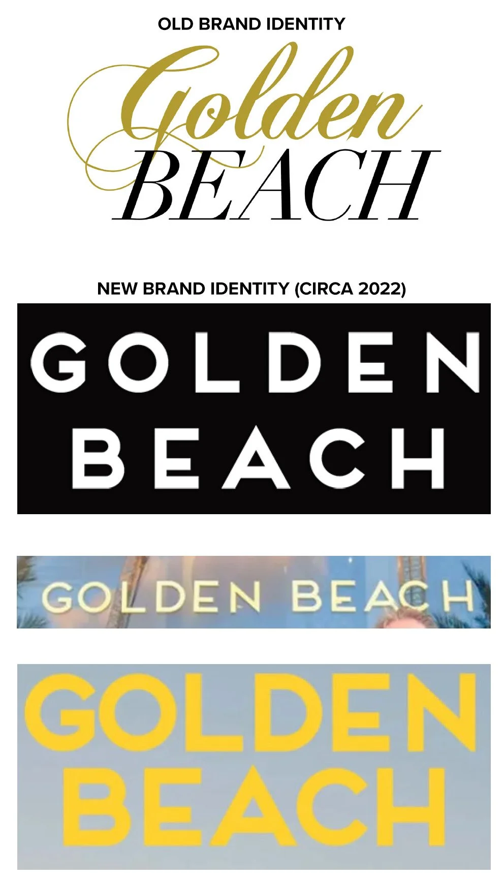
Around 2022, the Town of Golden Beach changed its brand identity from one logotype to another. The outgoing mark combined a golden hued flowing script font with a bold black italic didone font that embodied a ritzy feel.
The city’s revamped brand identity logotype embraces a modern, contemporary aesthetic with a geometric sans-serif font that hints at an Art Deco style with some of the letterforms. The nod to subtle luxury is there and this is a very clean look for a city that is known for its opulence. However, there were irregularities regarding the application of the mark.
As shown here, there didn’t seem to be a firm adherence to branding guidelines or a particular brand mark for outward usage. For instance:
the weights (thickness) of the words “Golden Beach” are inconsistent across applications (website, Town Hall, annual budget implementation seen here)
Kerning (spacing between individual letters) is inconsistent
Tracking (spacing between all letters) is inconsistent
Art Deco look feels more like Miami Beach, missing tie-in to Golden Beach
Consequently, this design project strives to rebrand the town’s brand identity and implement a cohesive branding rollout to maintain consistency across all touch points.
DESIGN REQUISITES
A mark that:
is visually consistent, regardless of application
accompanies appropriately spaced wordmark
captures unique town elements/symbols
is memorable and easy to identify
works at small and large scale
is complete with a brand identity system buildout
PHOTO COURTESY: TOWN OF GOLDEN BEACH
SKETCHES AND EARLY DESIGN IDEAS
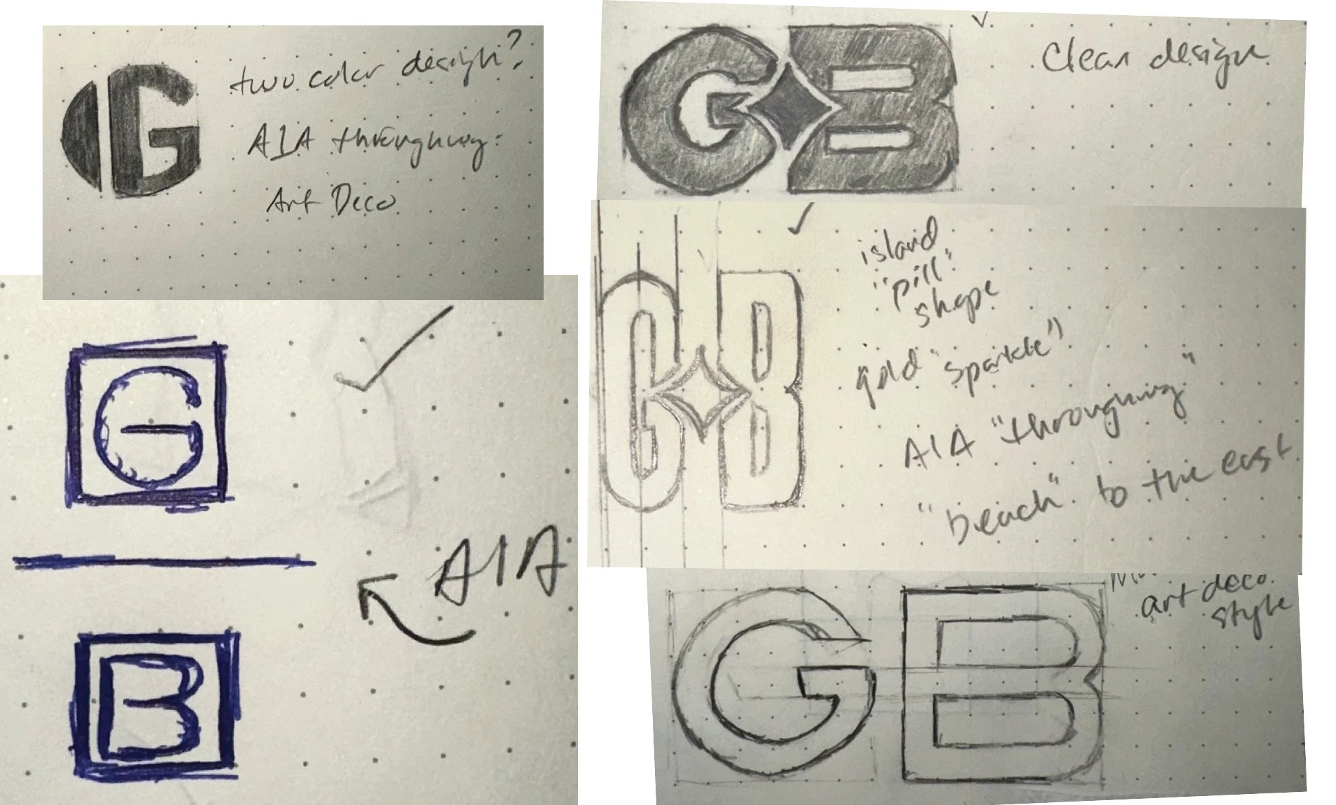
The sketching process allows loose ideas to become realistic visuals. Here in the Design Phase, vector images are explored based on the initial sketches to provide the client more tangible visual concepts.
FINAL LOGOTYPE AND LOGO SELECTION

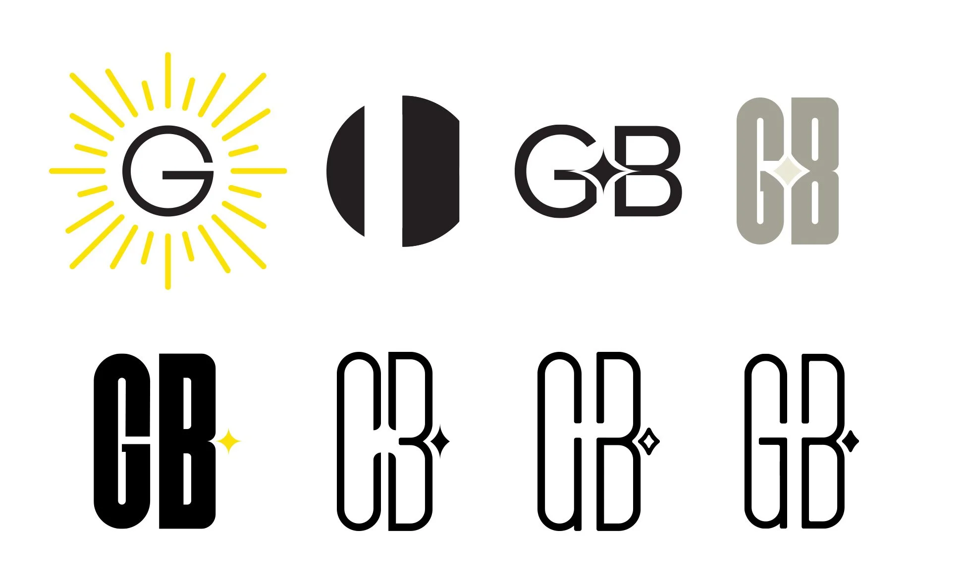
At first, it seemed natural to tie in Art Deco motifs into the new mark. The deeper the exploration went, a star design element emerged as an appropriate icon for the city. It represented a beach sunrise, calm luxury, and a bold brilliance - great symbolism for Golden Beach.
Taking a look at an aerial view of the town, three elliptical landmasses form the North, Central, and South Islands which are linked to the beachside barrier island. This presented an amazing opportunity to connect geographic form with brand identity.
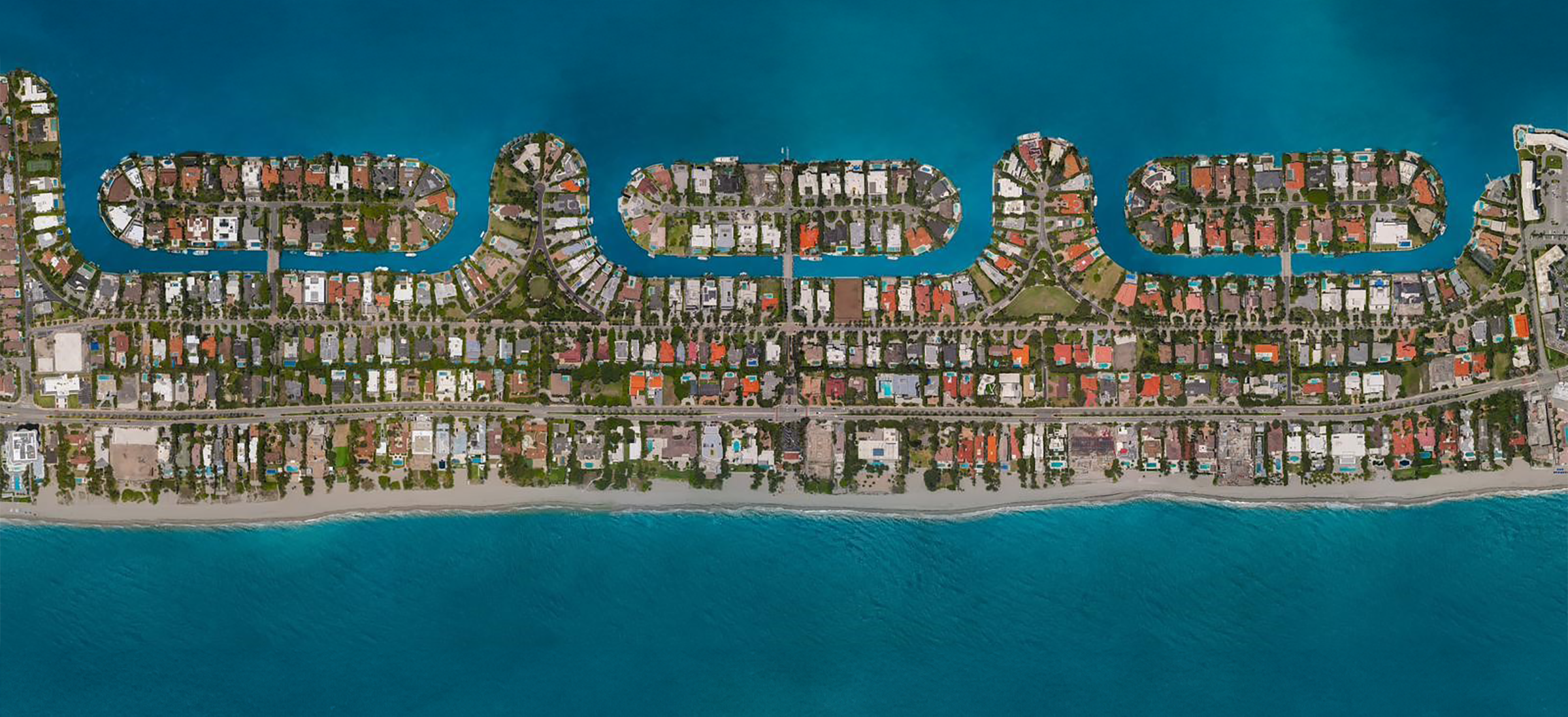
The “GB” logo captures this perfectly, with the elongated letterform mimicking the shape of the islands from above and the meeting of the “gaps” in the center of the mark representing the intersection of State Road A1A and The Strand, a short, gate-accessed road that connects A1A, the beach, and the rest of the town. The star element, just to the right of the letterforms symbolizes the rising sun that shines on the town from the east.
While the “GB” mark holds its own, the logotype is the primary mark. Continuing to reference the narrow and tall features in the town’s geography, an ultra condensed sans-serif font boldly displays the town’s name. The font exudes sleek elegance and match the look of the monogram.
The star icon is repeated to create a sharp and eye-catching pattern for more niche use cases. Lastly, a vivid goldenrod hue pairs well with the black and white color scheme.
There’s a big difference in simply viewing a brand identity on a white background versus seeing it in action. Mockups allow clients to view how their new logos will appear across multiple applications.
REAL-WORLD MOCKUPS

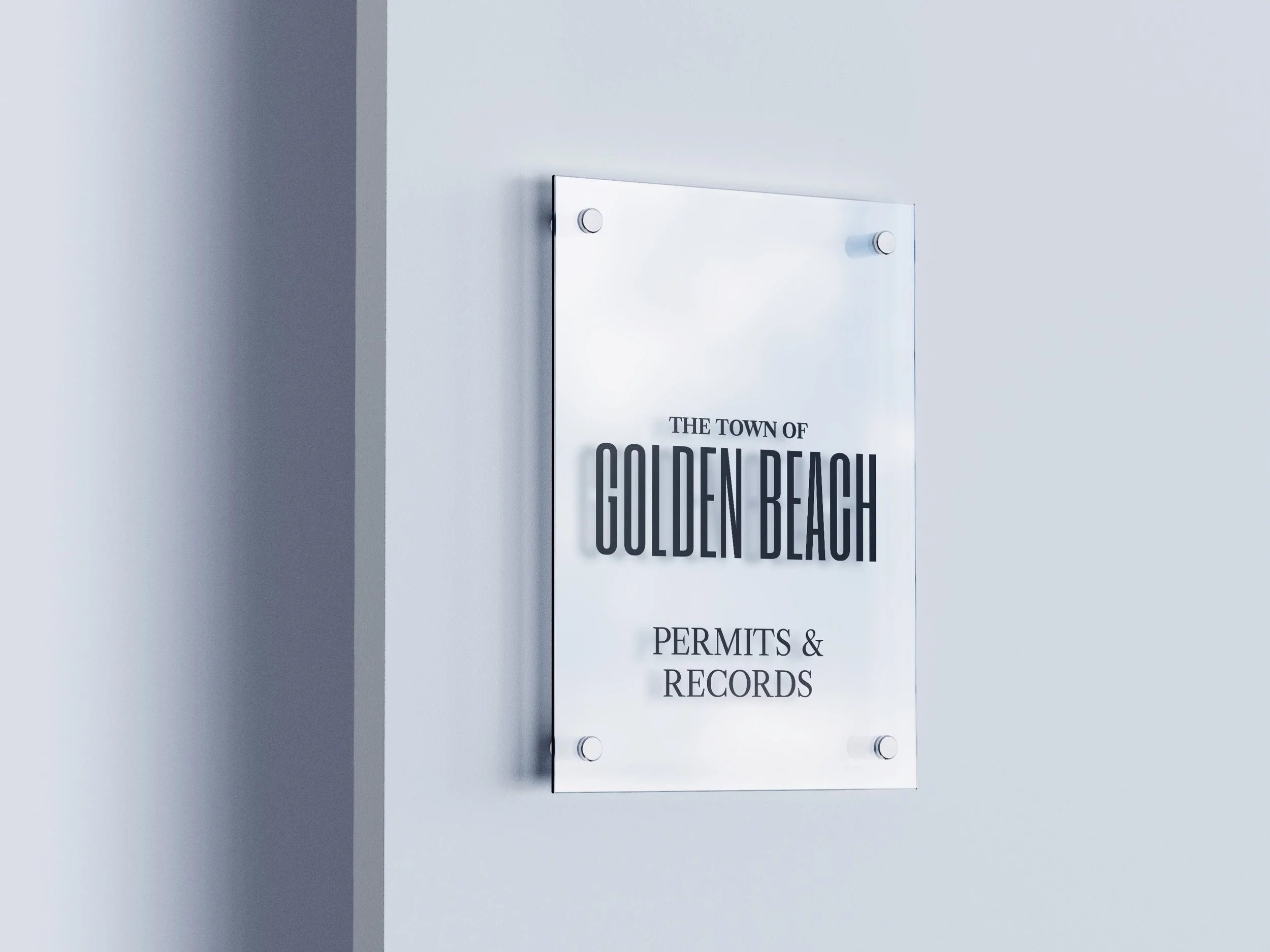


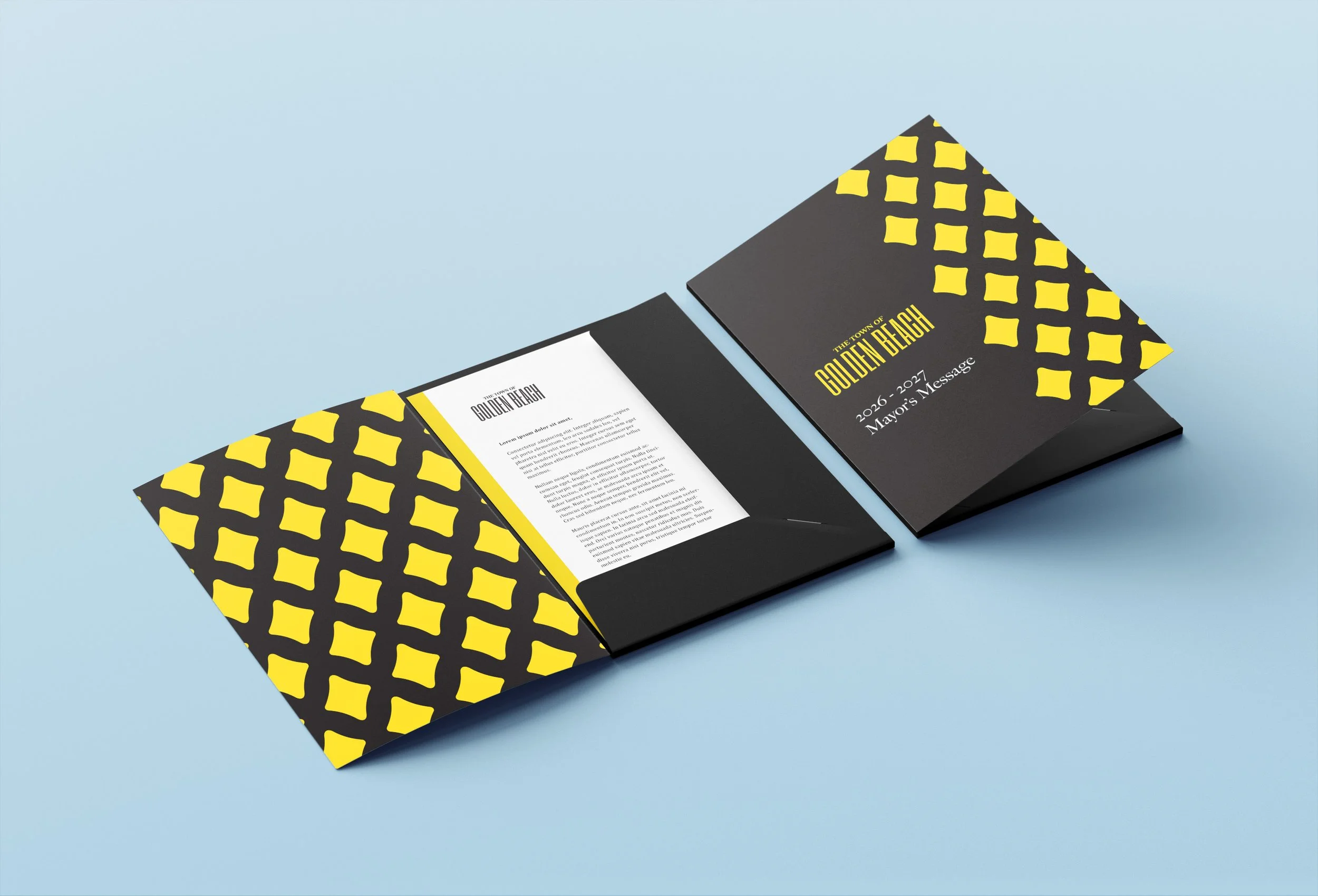


For the identity rebrand for the Town of Golden Beach, care was taken to maintain a feeling of exclusivity while still evoking a modern feel.
By literally taking a look from a different perspective, inspiration allowed MandelaMade to design a brand identity that spoke to the physical layout of the town and maintain visual consistency regardless of the scenario.
THE town OF golden beach
BRAND IDENTITY REDESIGN CASE STUDY (SPEC)